Studies have shown that users of streaming sites spend a large amount of time browsing possible TV and movie options before selecting something to watch. Considering most people turn to watching a movie or show when they want to relax and wind down from the day, a team of fellow designers and myself wondered how we could reimagine the Prime Video site in a way that was simpler, and didn’t add additional stress and complexity to the user experience.
Role: UX Design/ Research
Role: Entertainment/ Streaming Media
THE PROBLEM
How might we simplify navigation for Amazon Prime Video members in order to quickly and easily find a movie to watch?
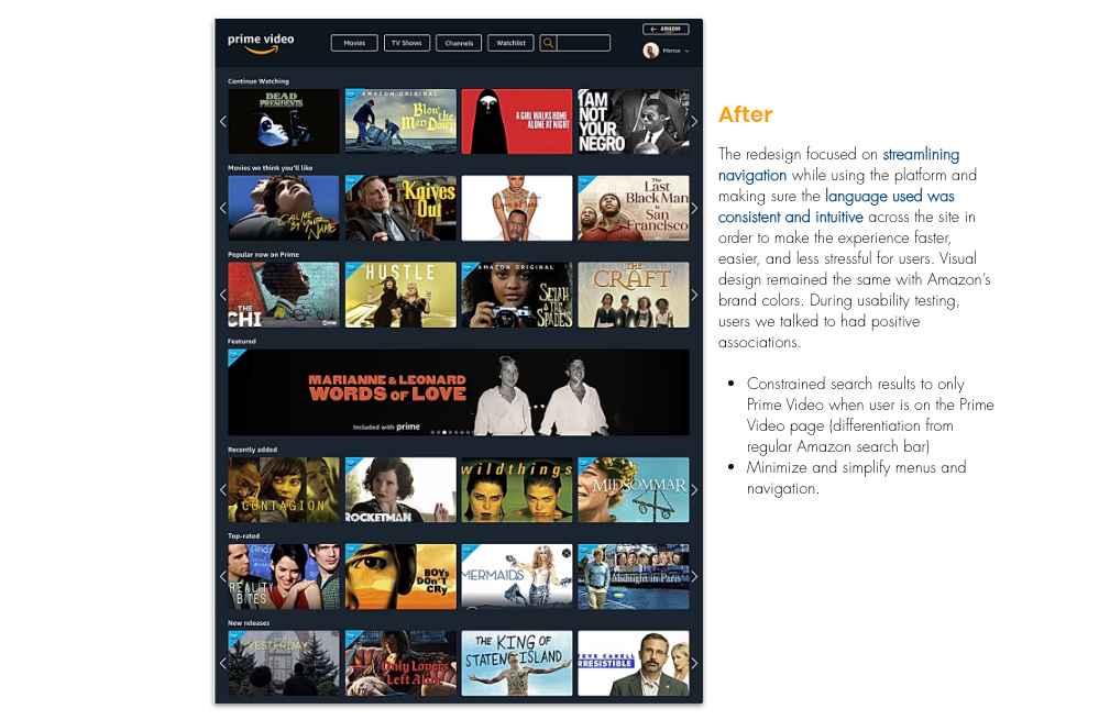
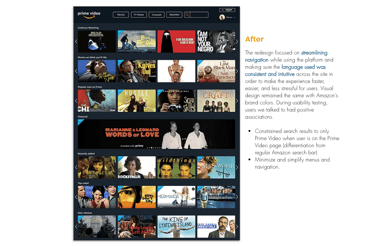
THE SOLUTION
The design solution we created focuses on streamlining navigation, to ensure finding something is easier and more intuitive for users.
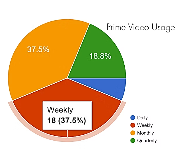
As the lead on UX Research, I wanted to understand the likes and dislikes of Prime Video users when navigating and streaming content, so we surveyed over 40 users.
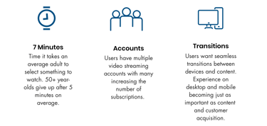
With 31% saying they could easily find what they were looking for on the site, the survey asked users what they most disliked about Prime Video. Keywords and phrases that stuck out were clunky, complicated, cluttered, confusing and poorly organized. They said things like "The Interface is so bad. It doesn't make browsing enjoyable.”


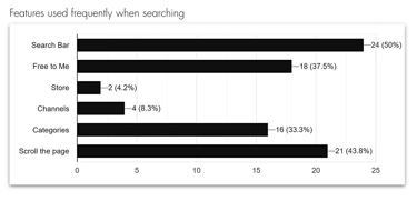
The survey was also used as an opportunity to let survey participants identify how often they used Prime Video and which elements they used when looking for something to watch. This gave an advantage, as I used this feedback to target those elements and prioritize them in our redesign.


UNDERSTANDING THE USER
Looking to understand user behavior when streaming movies and TV shows, the team did an analysis of the market and user behaviors.

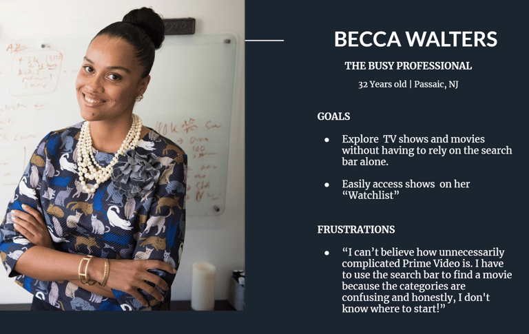
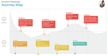
After analyzing user interviews, and survey data responses, two primary personas we identified and the focus was put on Becca's user journey to identify her pain points when looking for a movie to watch.


BREAKING DOWN THE PROCESS
The redesign focused on subtle enhancements to Prime Video’s current functionalities that would best serve users. Using Figma to create wireframes and prototypes, the goal was to concentrate on features that would minimize the time it took to find something to watch.

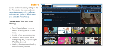
I performed usability testing on the Mid-Fi wireframes to measure the success of users being able to access a specific user profile, utilize the genre dropdown menu and return to the main Amazon shopping site. The creation of a general dropdown menu was to shift reliance on the search bar in lieu of the numerous categories and genres the Prime Video previously offered.
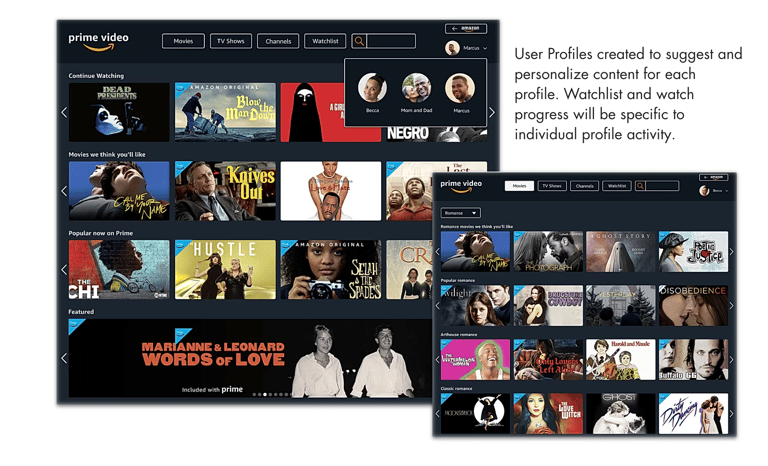
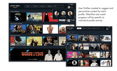
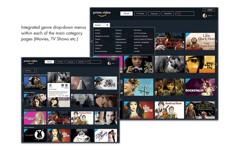

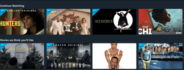
Language was made more relatable to that of similar platforms. "Continue Watching" would always be the first category in every sign in. The "Free to Prime" banner was changed to "Free," along with a bolder blue banner in order to stand out to users looking to stream solely free content.

OUTCOMES & LESSONS LEARNED
While redesigning the Prime Video site, Amazon did the same, and the design team noticed many changes to the live site while doing further research and iterations of design. They had incorporated many of the redesign ideas we derived at, such as a sticky navigation to eliminate the overcomplicated options, user profiles in order to switch between accounts and have minimized the features of paid content and pushing more "free with prime" content. This proved the team was headed in the right direction in our research and design decisions.